
Tags
art, blue and gold, color psychology, creativity, Odilon Redon, painting, Paintings, Pinterest, watercolor
I’ve long had a thing about the colors blue and gold, especially in combination. Something about them soothes and excites me. I created a Pinterest page of nothing but images of blue and gold. I go there to feel enriched, refreshed. To simply bask in the feelings these colors evoke. Depth and richness, serenity and empowerment.
Blue is the color of the sea and the sky, or sleep and twilight. In color psychology it represents mystery, depth, intuition. It also symbolizes intelligence, inspiration, wisdom and spirituality, even the Virgin Mary. One source considers blue as “beneficial to the mind and body.” It is associated with peace and tranquility.
The color gold is associated with “illumination, love, compassion, courage, passion, magic, and wisdom.” It symbolizes self-purification, humankind’s quest to perfect, illuminate and refine ourselves. In Christian art it is often used to convey divine love.
Together, I think they symbolize the creative spirit, with all the mystery and intuition, passion and empowerment that implies.
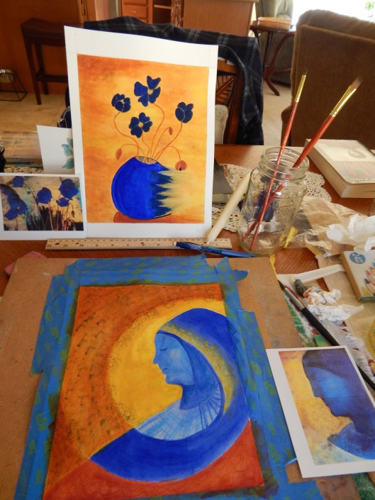
Sometimes I find myself dreaming of images in blue and gold, and that’s where these last two paintings come from. Both were inspired in part by paintings of Odilon Redon, his blue poppies, his lady in blue, as shown above.
But in my dream, the poppies were dancing, lighter than air, in a deep blue bowl, partial and incomplete. As if blown away by, or evaporating into, the light.
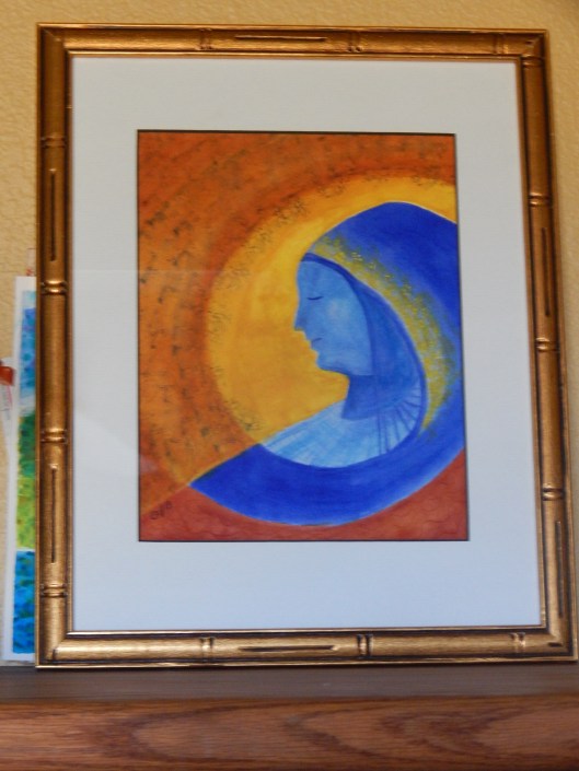
My blue lady, deep in meditation, became sphinx-like, swathed in swirling spirals of blue and gold.
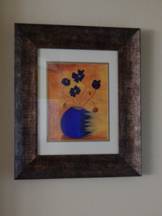
The blue I used is my favorite, Daniel Smith’s French Aquamarine, which I used straight from the tube with only enough water to allow it to flow. Applied that way it has such a velvety texture it makes you want to touch it.
The gold is Smith’s Quinacridone Deep Gold, another favorite, which I mellowed with Cadmium Yellow Light.
The poppies are framed now at the end of my hallway. I named it, appropriately enough, “Dancing Poppies in a Blue Bowl.” Although sometimes I just think of it as “blown away.” I like the lightness of the poppies, the weight of the bowl, the way the whole piece is in motion.
The other, “Meditation in Blue and Gold,” is leaning on a bookshelf in my study. When I glance at her she instills in me that sense of peace and inspiration and love essential to any creative task.
Discover more from Deborah J. Brasket, Author
Subscribe to get the latest posts sent to your email.

The writer in you recounts the creative process eloquently; the emerging artist in you is bringing it to our visual attention.
Brava!
LikeLike
Thank you, Laura. I’ve been enjoying this.
LikeLiked by 1 person
The colors are gorgeous … so vivid! While I love both paintings, those poppies really appeal so to me. I’m so impressed with your work, and the description of your work, Deborah
LikeLike
Thank you, Laurie, I’m glad you liked them. That means a lot to me.
LikeLike
I’ve always been attracted to blues and oranges as they are together; I find that I often want to bring in those purple tones, too. Your meditation on these colors is beautiful. I like how you mellowed out the gold with the cadmium yellow. When I used to paint, we were always taught to mix rich colors and blends, never to draw straight from the tube. Well, of course, when I paint now, I do what I want! Nevertheless, I’ll always tend to appreciate the mixing of color and the challenge to match it later on, or where to store it so it doesn’t dry out, etc. This is especially challenging with oil if I remember correctly. Isn’t the whole process the real joy?
LikeLike
Yes, the whole process is a joy. I love mixing colors too, but sometimes the pure colors straight from the tube is what I need. I’ve never worked in oil, but I’d like to give it a try. Because I like such strong colors, sometimes oil or acrylic is where I need to go next.
LikeLiked by 1 person