
Tags
art, author websites, book covers, book titles, Novel, personal, self-publishing, the creative process
I haven’t been posting as often as I like lately, I’ve been so busy with the production of my novel, which has included some significant changes. The title for one.
From the very first when I sent my query letter to agents, it was called From the Far Ends of the Earth. It tells the story of three family members left behind when the mother at the center of their lives mysteriously disappears. How they cope with her disappearance, learn to reconnect with each other, and forge new relationships in her absence create the heart of this novel.
But it’s also about the journeys of self-discovery each protagonist takes to piece back together their fragmented lives and make themselves, and their family, whole again. And that’s what I was leaning toward when I created this first cover design:
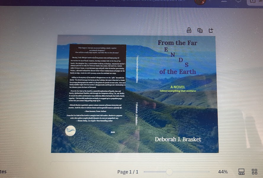
I loved this cover and also the name. Unfortunately, others did not. People in the business I trusted thought the background photo of a range of hillsides looked washed out, uninteresting. They also thought the name When Things Go Missing (which was the title of Part One in my novel) was more compelling.
Eventually I agreed with them and hired a book designer to create a cover for my new title.
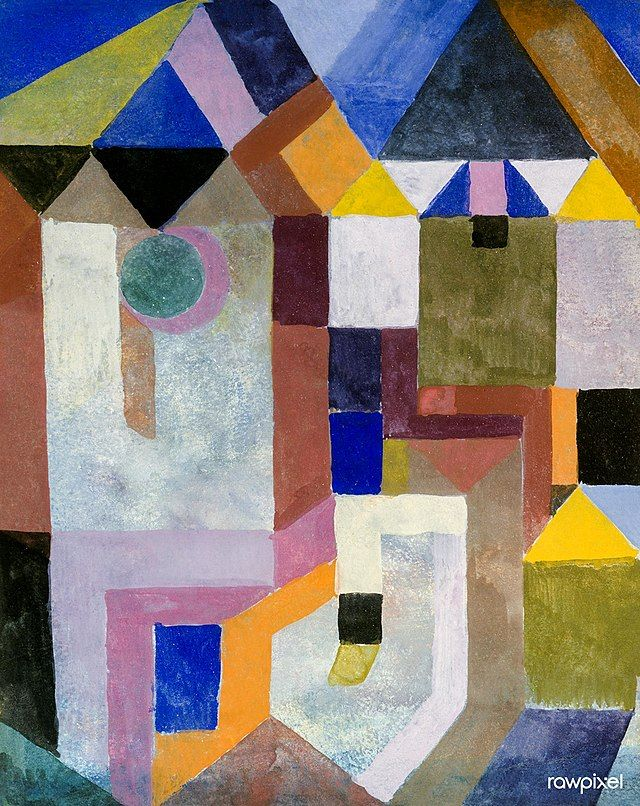
I wanted him to use Paul Klee’s artwork, now in the public domain. I’ve always loved his paintings, the bright colors and playful images. I thought the patchwork pieces of his people and houses would work especially well with the new title, reflecting a major theme of the novel–the “missing” pieces in the lives of the family members left behind when the mother, the one person who had been holding them together, mysteriously disappears.
We ended up using the painting at the top of this post, Klee’s “Colorful Architecture.” One of the house-like structures is whited out: “missing.” The silhouette of a person is added, looking longingly at the missing house and what it represents: home, wholeness, family, security, comfort, belonging.
We’re in the final stages of designing that cover and I’m loving it so far. But I still look back longingly at the original cover, which depicts the journey each character takes, the distance between them.
The one thing I’m not still debating is the title. I love the original title, but I agree the new one is catchier and more compelling. And the new title with the new cover will probably give the reader a better sense of what the book is about. (One person looking at the original cover thought it was a book about travel.)
So all of this is a work in progress. And there’s still so much left to do! Including updating my website.
I created a page on this site about my novel, When Things Go Missing, and two others I’m working on. But the “editor” isn’t working properly or letting me do what I want with the headings and so on. It may be because the website theme I’m still using is so old. I probably need a new theme. Or a new website altogether. But I’m not ready to do that yet. And when I do migrate to another site I don’t want to lose all the posts I’ve published here over the past thirteen years.
So I’m trying to stay here for a while longer and update this site to work as an author website for the time-being. I changed the landing page from the blog to the novel page, so when people link to my site, that’s what they will see first. You can take a look at it here.
I’d love to hear your thoughts on any of this. And if you have any experience in changing themes without losing posts, or migrating to new websites, please share!
Discover more from Deborah J. Brasket, Author
Subscribe to get the latest posts sent to your email.

In the original cover, did you intend any significance in the title forming a backward Z?
LikeLike
That Z was just one of many title placements I was trying out. But I thought that gave the book an edgier appearance and the slanted line symbolized a journey between two distant places.
LikeLike
Congratulations, Deborah! I agree with the title change, for all the reasons you stated. I know how easy it is to get attached to the original versions of our own work. Rick Rubin calls this “demo-itis” (when musicians get attached to the demo version of a song).
I have no objection to the original artwork WITH the new title (no confusion about travelogues), and the wilderness depicted looks like a place for things to go missing; but that said, I adore Paul Klee and love the tie-in of the patchwork/puzzle-piece art with the human element planned for the depiction. Best of luck moving forward!
LikeLiked by 1 person
Thanks, Camilla! I had thought about that, putting the new name on the old cover. But now I love this new cover and will share it soon. Thank you for your encouragement!
LikeLiked by 1 person
Congratulations! Don’t know much about migrating (or backing up), and I’ve been here almost as long as you (11 years). But Klee is an inspired choice. I’ve been studying his work and there is a lot to unpack in most of his pieces.
LikeLike
Thank you! I am excited about this book and really happy with the Klee adaptation for the cover. As you say, there’s lots to unpack about his artwork. i’d love to hear what you’ve discovered in you studies. Have you written about it on your blog? I love your work, BTW. I’ve been watching your artistic growth these past 11 years too. It does go by fast doesn’t it!
LikeLiked by 1 person
Thanks you Deborah! Some of my recent pen and ink sketches have been influenced by Klee. I’ve commented about his work, particularly about his visual language and have been trying to incorporate some of his ideas (or my concept of his ideas) into my drawings.
Best of luck with your book!
J
LikeLike
The Klee cover is awesome! Colors catch! It’ll stand out on the book shelves …
I’ve been with wordpress for a long time, too. I’ve changed themes, and I have even closed my account for a year, but nothing disappears, trust that. It’s all there, no matter what you do. And I have an upgraded version (more money), which means I have help from wordpress techies. I’ve chatted, emailed, and all that to get help. Must admit that wordpress has gotten fancy with many more added features, and it can be hard to keep up!
LikeLike
Thanks, Elizabeth. I’m surprised there isn’t more of Klee’s work being adapted for covers now that its in the public domain. he has so much to choose from. And thanks for your feedback about the website! Maybe I need the updated version as well so I can get techie support too.
LikeLiked by 1 person
All of this is good news because it is **progress** in many of the details that need to be worked out in prep for the upcoming book launch etc…including the chore that is so not fun: updating one’s website. My #1 bit of advise: backup before proceeding to do anything, even changing themes…and take care to not rush into updating all plugins all at once. Luckily there are numerous tutorials on youtube along with the WP Forums etc that can give detailed info when needed. Yes, it’s an arduous process, but little by little it can be done!
Good luck!
LikeLike
Yes, progress! It does feel good. Thanks for the advice on the website. I haven’t backed-up at all! Unless it’s done automatically?? I’ll have to check out those you-tube tutorials and see how it’s done. Your new site is beautiful. I see it was designed by Anders Noren. Do you recommend him?
LikeLiked by 1 person
My website is with his ‘Hemingway’ Theme and I’ve had absolutely no problems with it. His themes are spartan (uncluttered), adaptable and effective IMHO. When looking into his newer themes I realized any theme **created** in 2014 (mine) lacks access to current WP features that cannot be enabled via updating. SOOOO I’ll be factoring that into my own revamp. And will no doubt need to quit putting it off! HA! Ugh.
Needs change, but we manage to make do with what we’ve had – until the last possible moment, eh?! more info: https://andersnoren.se/
LikeLike